Example 1:
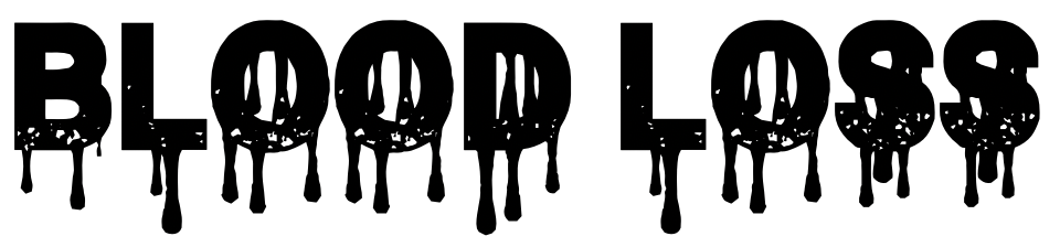
We chose this font idea because there is blood dripping from the letters which relate a lot to the movie of the title.
This can create fear for the audience as this can represent what may happen later on in the film.
This helps us engage the viewer more. As well as the font is black and bold however I may change the color
This can create fear for the audience as this can represent what may happen later on in the film.
This helps us engage the viewer more. As well as the font is black and bold however I may change the color

Example 2:
We chose this font idea as to its very bold and it also has a very hallucinating look to it which represents one of the main themes in our opening sequence as the main character has a loss of memory from events that happened before and wakes up with blood all over him so it gives them this modern look on a title as well as its a very simplistic look so it's not too cartoonish but gives off a serious and tense environment for the opening sequence.

No comments:
Post a Comment